How the look of one of my favorite movies of this year was made
This year has been a decent year for movies all things consider. Especially those in the realm of animation. Among all of them, one of the movies that has been released that really became one of my favorites of the year is "The Mitchells Vs. The Machines".
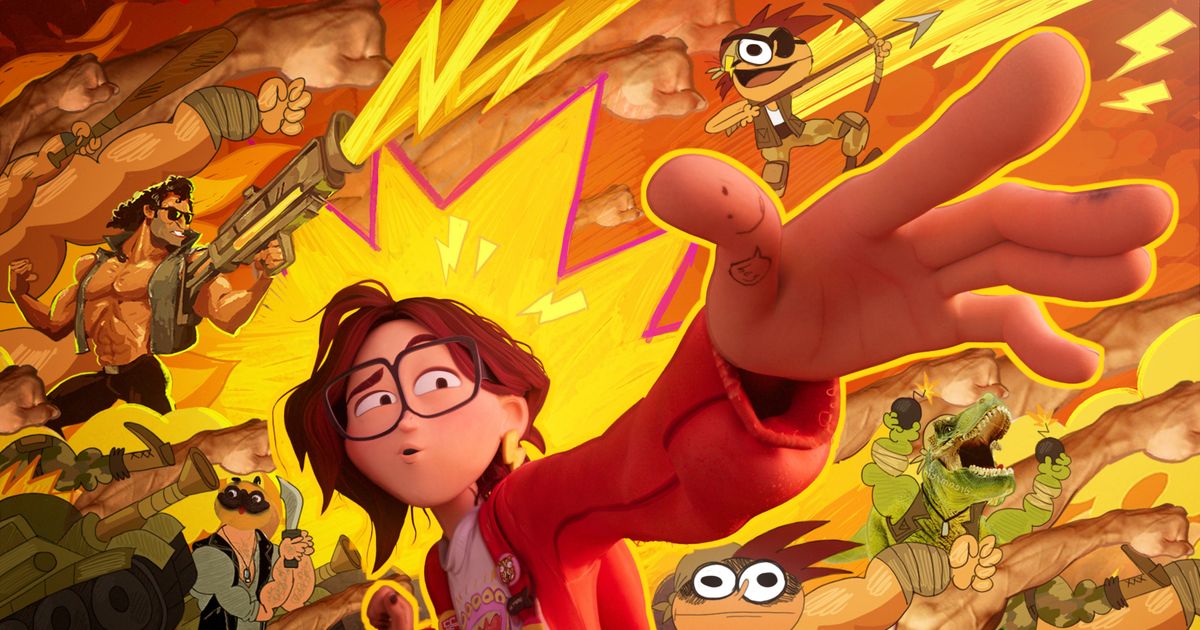
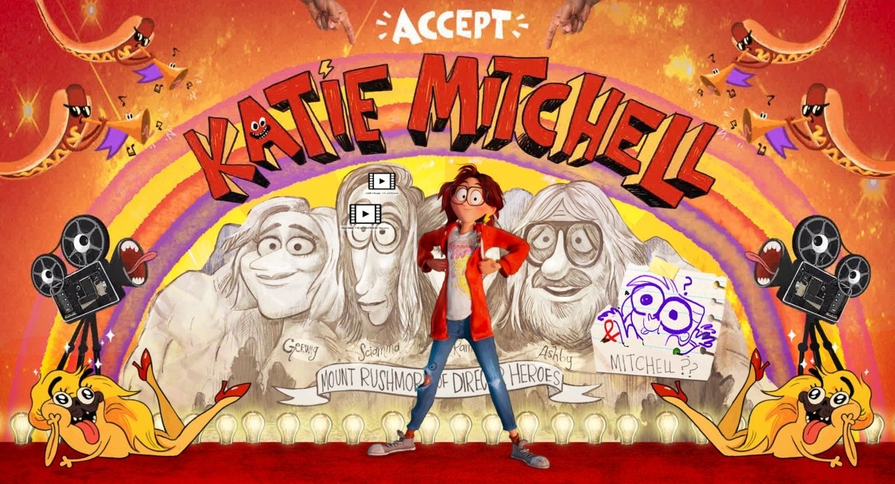
Produced by Phil Lord and Chris Miller, the brilliant duo behind The LEGO Movie, and coming from Sony Pictures Animation the movie tells the story of an aspiring, young filmmaker named Katie Mitchell who goes on a road trip with her family to a college she go accepted in. Unfortunately, their road trip gets interrutped by a robot uprising which threatens the whole world.

It's a heartfelt and extremely funny film that feels like a mashup of "A Goofy Movie" and "Maximum Overdrive", but what really makes it stand out is the film's unique animation style.
The film is a hybrid combination of 3D and 2D animation. Similar to the Sony Pictures Animation's previously released "Spider-Man: Into The Spider-Verse". Called "KatieVision" by the film's crew, the movie uses 2D animation and graphics to showcase how Katie sees the world and it really give the movie even more personality than it already had. I was in awe of this when I was watching the movie and I wanted to know the animators and artist managed to bring this style to life.
Luckily, there are multiple videos on how they crafted the style, how they use what they did with Spider-Verse and brought it to this film, and merging both 2D and 3D Animation.
My favorite video of these behind the scenes processes is this one: https://www.youtube.com/watch?v=YJ42ruf2WQE
It's really fancinating to see how this studio brought this unique style to life and created another movie that really pushes the medium of animation further. I think Sony is really beating Disney in terms of distinctive animated films.


Comments
Post a Comment