Why Sonic's movie redesign was better and much needed
During one of our class sessions, we were talking about how vital and important the usage of "critiquing" was in the field of design. during that discussion, the topic of the Sonic The Hedgehog movie was brought up and how big the backlash and critique of Sonic's original design was.
Having to have also been one of the people who chimed into critiquing the design back in 2019 when it was first released, I thought it would be fun to explain why Sonic's original design did not work and why the the redesign was a much needed improvement.
The problem with Sonic's original design came down to two factors: "realism" and "recognizability".
First off, "realism". When you look at an image of Sonic, the first thing that that should come to mind is that he is no way realistic. He very much unrealistic in every single way.
/cdn.vox-cdn.com/uploads/chorus_image/image/69339719/sonic_30th.0.jpg)
The design's first mistake was trying to break the parts of Sonic's design down into something that could fit into our realistic world. Instead of cartoon gloves they gave him realistic small hands, instead of big red shoes he has small ones, and instead of a single combined eye he has two separate realistic eyes.

By trying to make Sonic look more "real", they unintentionally made him look more uncanny and way less appealing than his original design. Instead of trying to bring the elements of his already existing design together to make something that looked like Sonic, they threw most of it away and retooled it.
This is where "recognizability" comes in. There is a right way and a wrong way to bring a beloved, cartoony character into a realistic world or live action setting and still stay true to how the characters look.
A good example would this year's recently released Live Action/CGI Tom and Jerry movie.
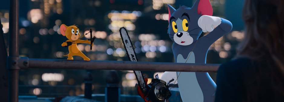
Regardless of what I think about the movie, if there's one thing that movie absolutely nailed were the look of Tom and Jerry. Anyone can look at these designs and tell who the characters are. The animators and artist did a phenomenal job bringing the 2D look and feel of the original shorts to these characters into CG. They did not sacrifice how iconic the look of the characters are to make them look close to an actual cat and mouse or something like that.
When you are bringing a cartoony character like Sonic to into a live action setting, you owe it to the character and how ionic they are to stay as true as you can to the design while transitioning them into a real world. There's a reason why people tend to not be fond of movies like Alvin and The Chipmunks, or Garfield, or Smurfs because they all tried to reinvent how he characters look to make them more realistic instead of embracing the cartoony parts of their original designs.
This is where the redesign succeeded. What the CG artists and animators did with the redesign was stay true to the look of Sonic that everyone knows and loves, but only make changes to small things such as making his arms blue instead of tan and keeping his eyes separate. While the eye are operate, they also them more bigger in comparison to the original design which still is remiscent to how big the eyes of his original design are.
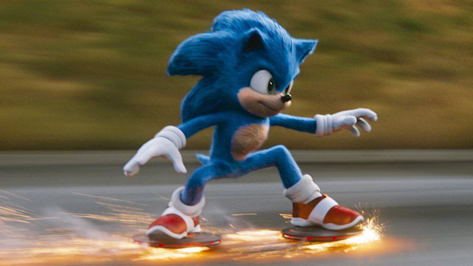
The comparison between the redesign and the original design is night and day. The redesign stays true to the look of the character while making some slight alterations and the original design was just an abomination lacking any understanding of the appeal of Sonic's design. The goal of bringing an iconic character to a realistic world should be focused on staying true to the look of the character people know and making it look real or belivable without losing the charm of the original design.
And as someone who has seen the movie, that redesign plays such a big part of how you get attached to Sonic as a character throughout the film. The movie puts a lot of emphasis on scenes that require that design to me highly emotive so you can feel for the character and it completely delivers. Had they not listened and kept the original design I highly doubt that design could pull off what the script is asking of it without coming off as uncanny.


Comments
Post a Comment