How Speed Racer Uses CG
When it comes to adapting a cartoon or anime to live action, you run into a variety of problems. What is the tone going to be, what elements from the show are going to work best when transitioning them to live action, and most importantly what is the look of the movie going to be.
Out of all the live action adaptations I've seen, there is one that has such a distinctive look to it that really stands out. That being 2008's Speed Racer.
Directed by The Wachowski Sister's, the movie is obviously based on the 1968 show of the same name, this adaptation does the exact opposite of what a lot of adaptations tend to do visually. Whereas most live action adaptations of a popular anime or cartoon strive for realism or a sense of grittiness depending on the material, The Wacchowskis' instead embraced campy and colorful style of the show.
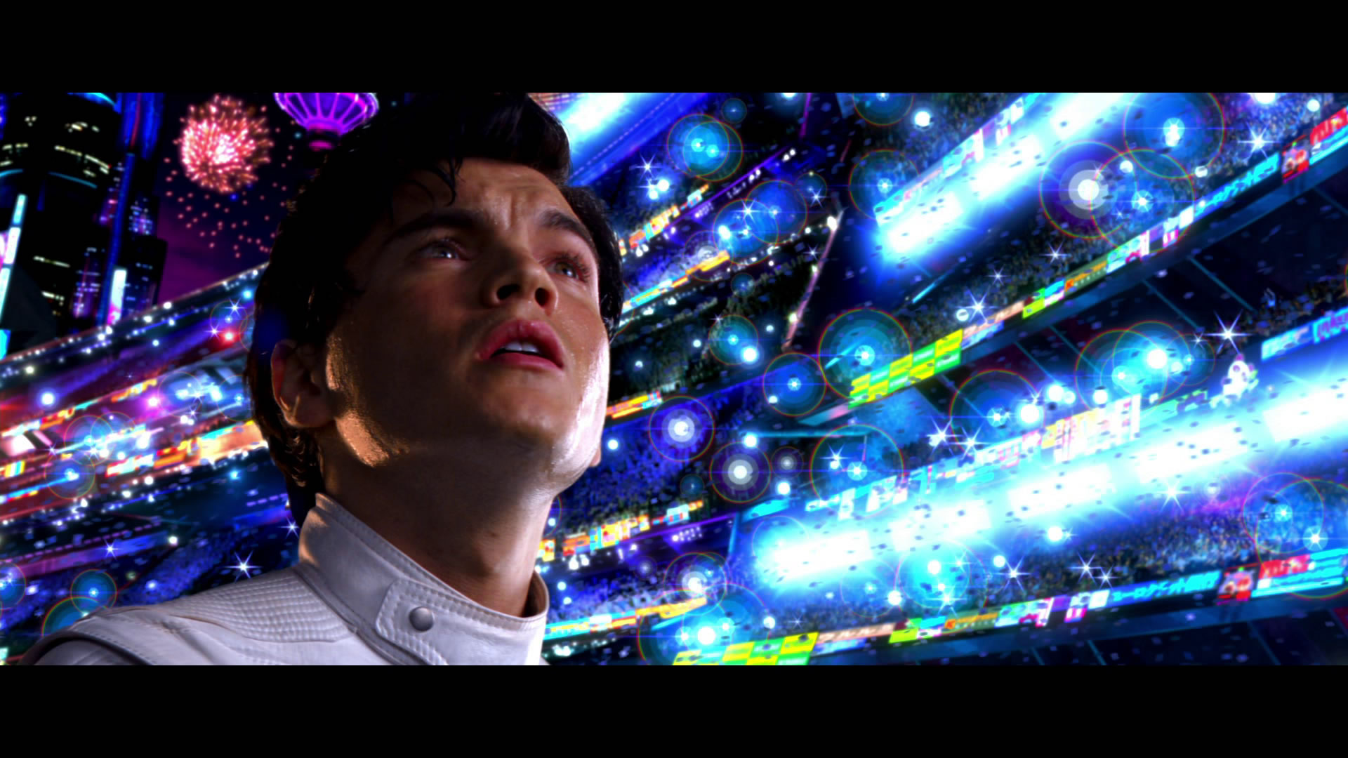
And no where is that fuller on display with than with the CG. This has to be one of THE most colorful movies I've seen and while some of that has to do with the cinematography and production design, it also is heavily present in the VFX.

80% of Speed Racer is reliant on VFX, especially when it comes to the racing sequences. Unlike a lot of racing movies where practical cars would be used, this movie instead opts to have the cars and racing scenes be all CG. Because of this, The Wachowski's use the CG to go all out on the races and deliver eye-popping sequences that can really push the action and embrace the unrealistic things that could only be done in the cartoon.

The CG just oozes so much style and makes the races a blast to watch. Even if the movie feels likes its squeezing a bunch of rainbow sherbet all over your eyes.
/cdn.vox-cdn.com/uploads/chorus_asset/file/22529609/55__885_.jpg)
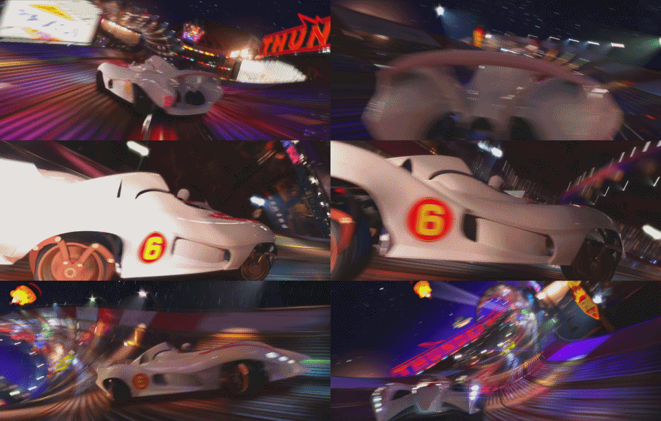
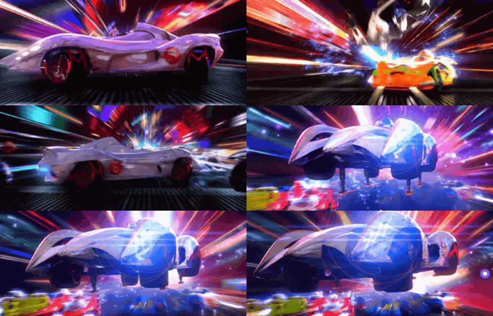
It's been 13 years since this movie realized the CG work still holds up VERY well for what this movie tried to do. Definitely feel that this is one of the golden standards for a live action adaptation, especially on a visual level.
Comments
Post a Comment